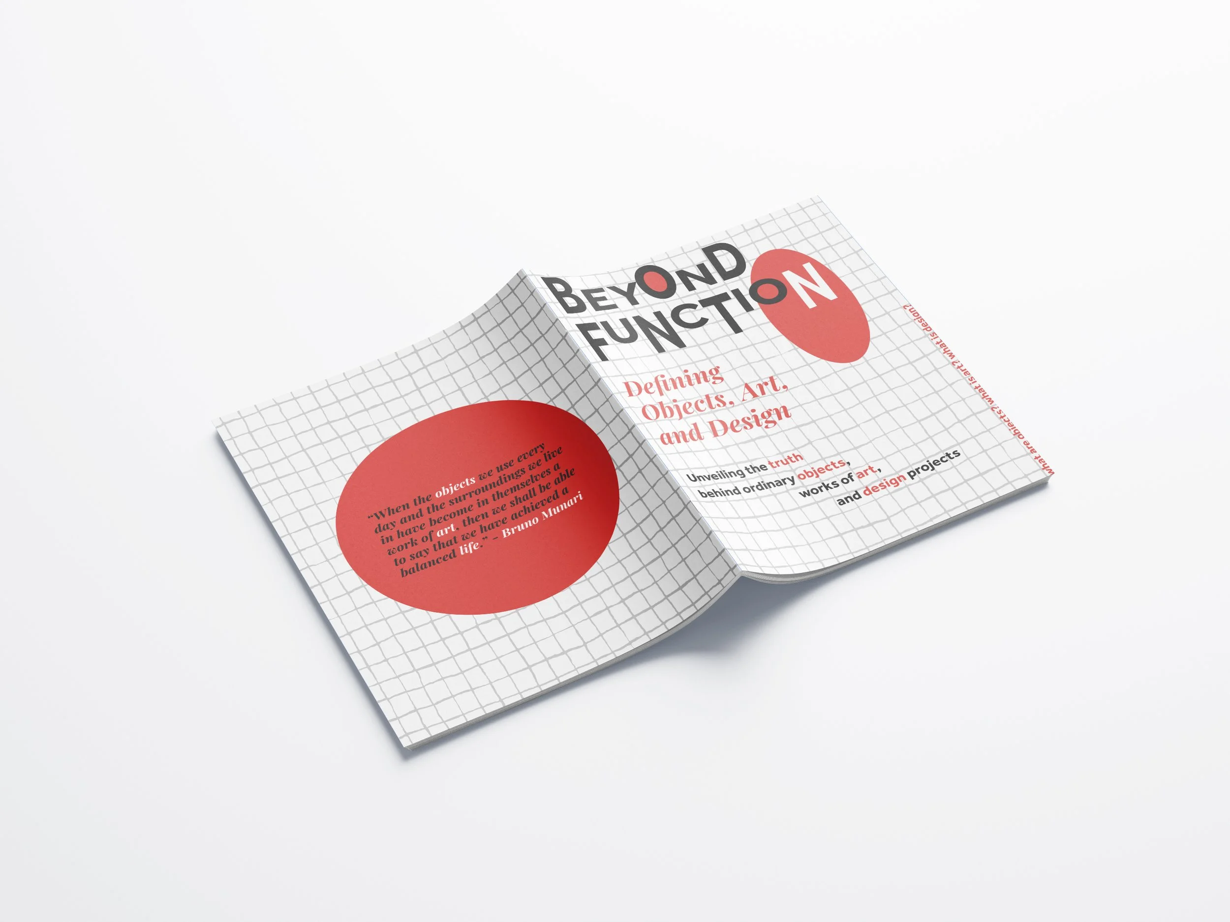
The Virtuous Book
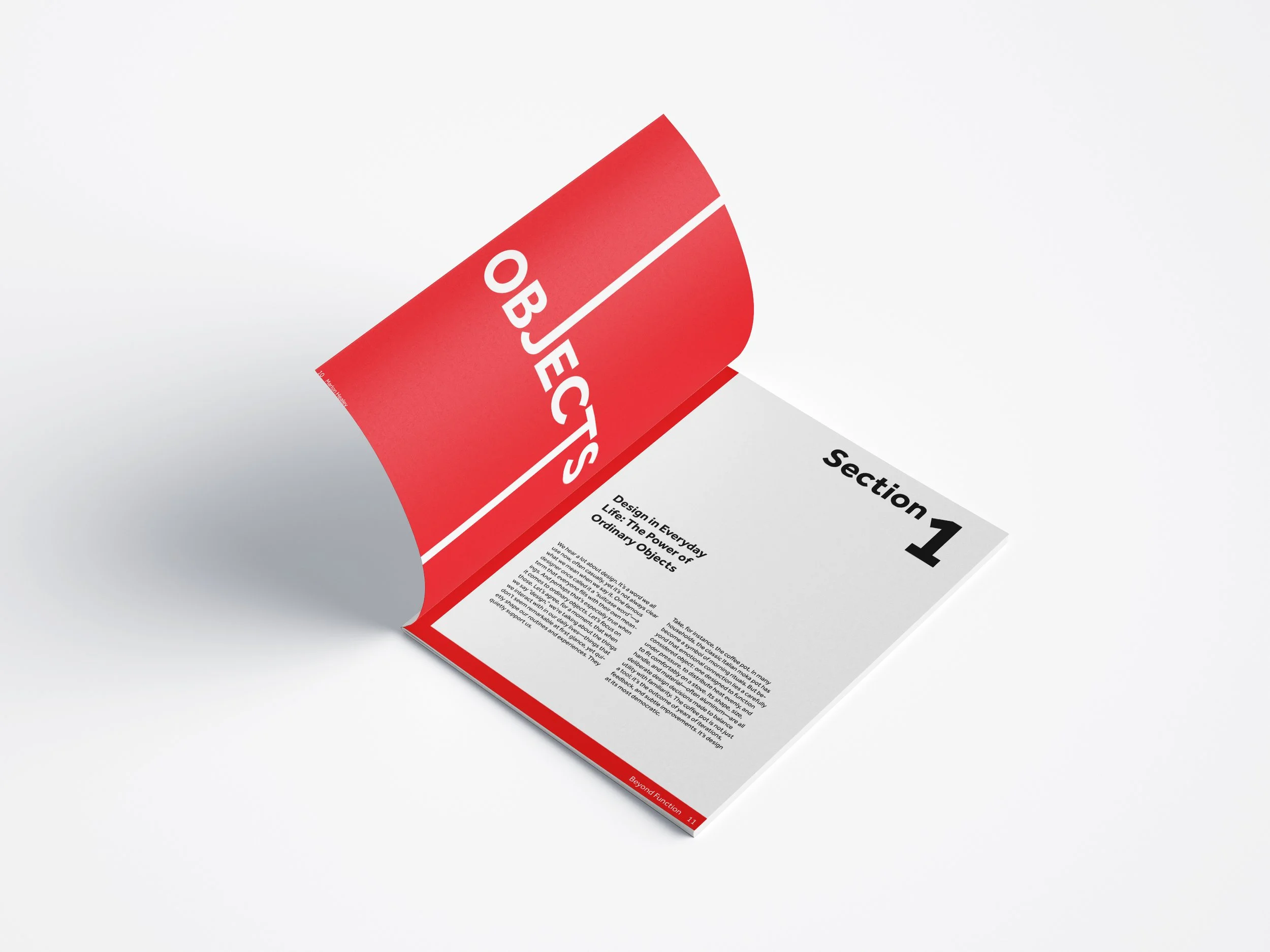
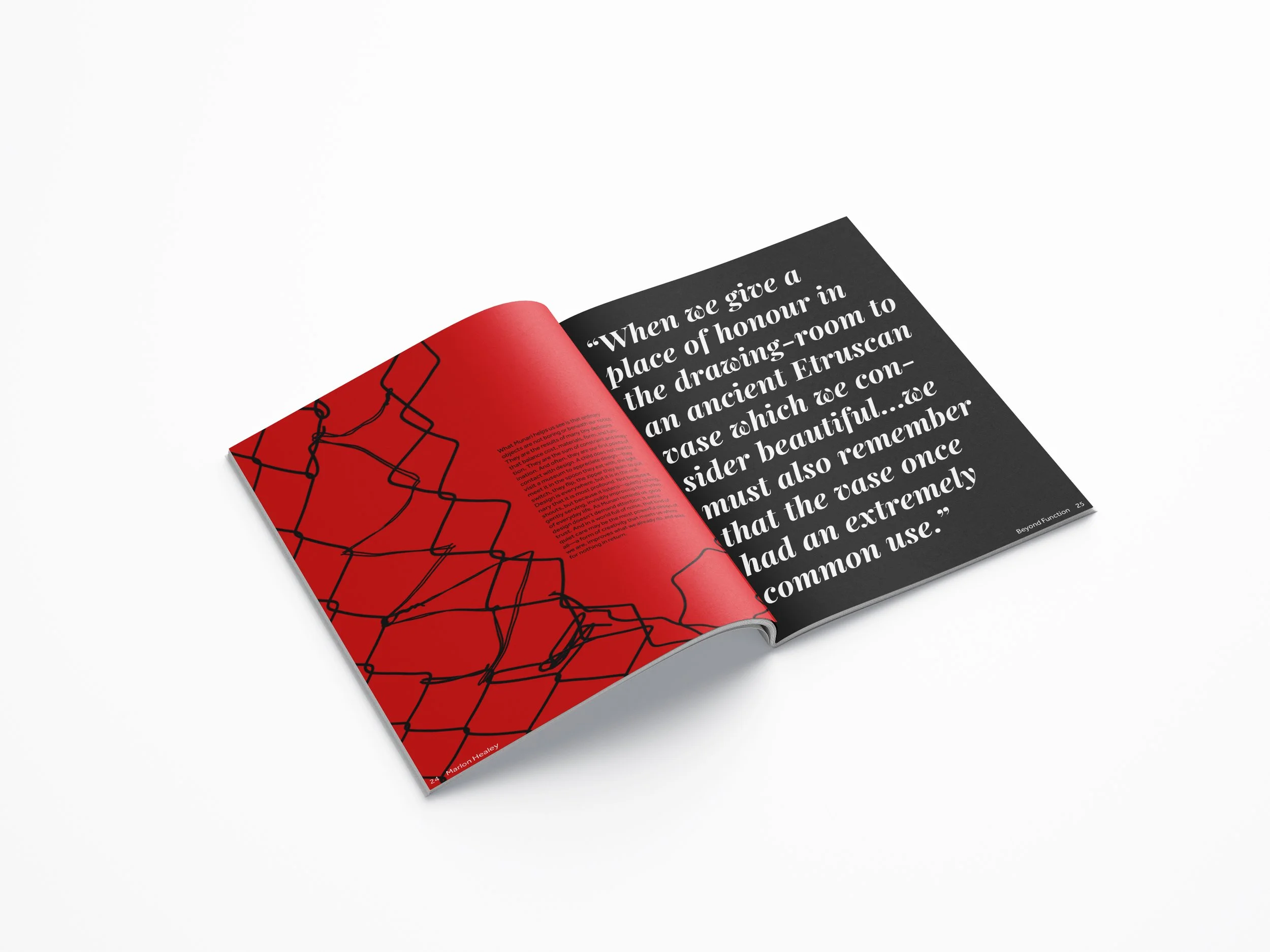
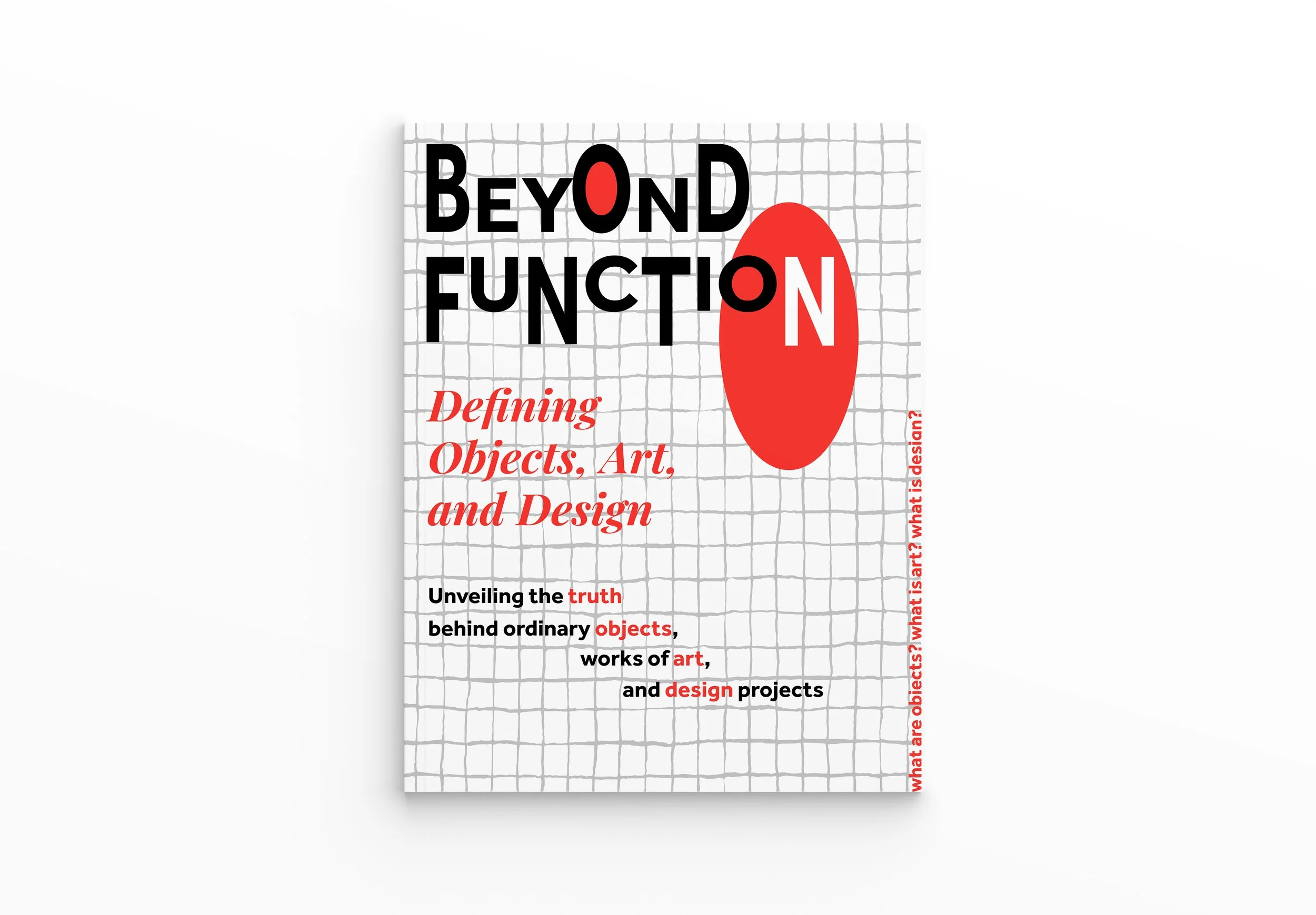
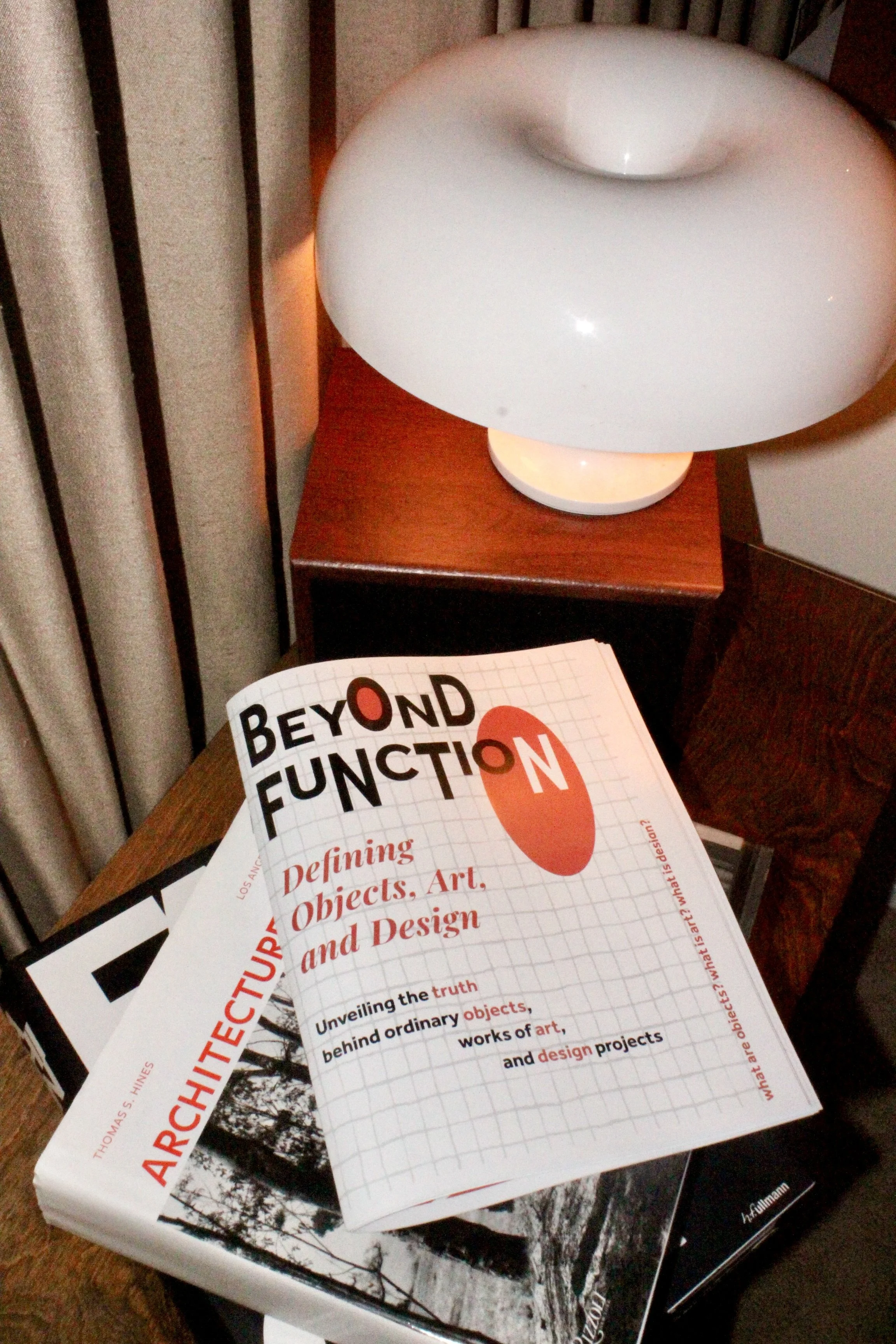
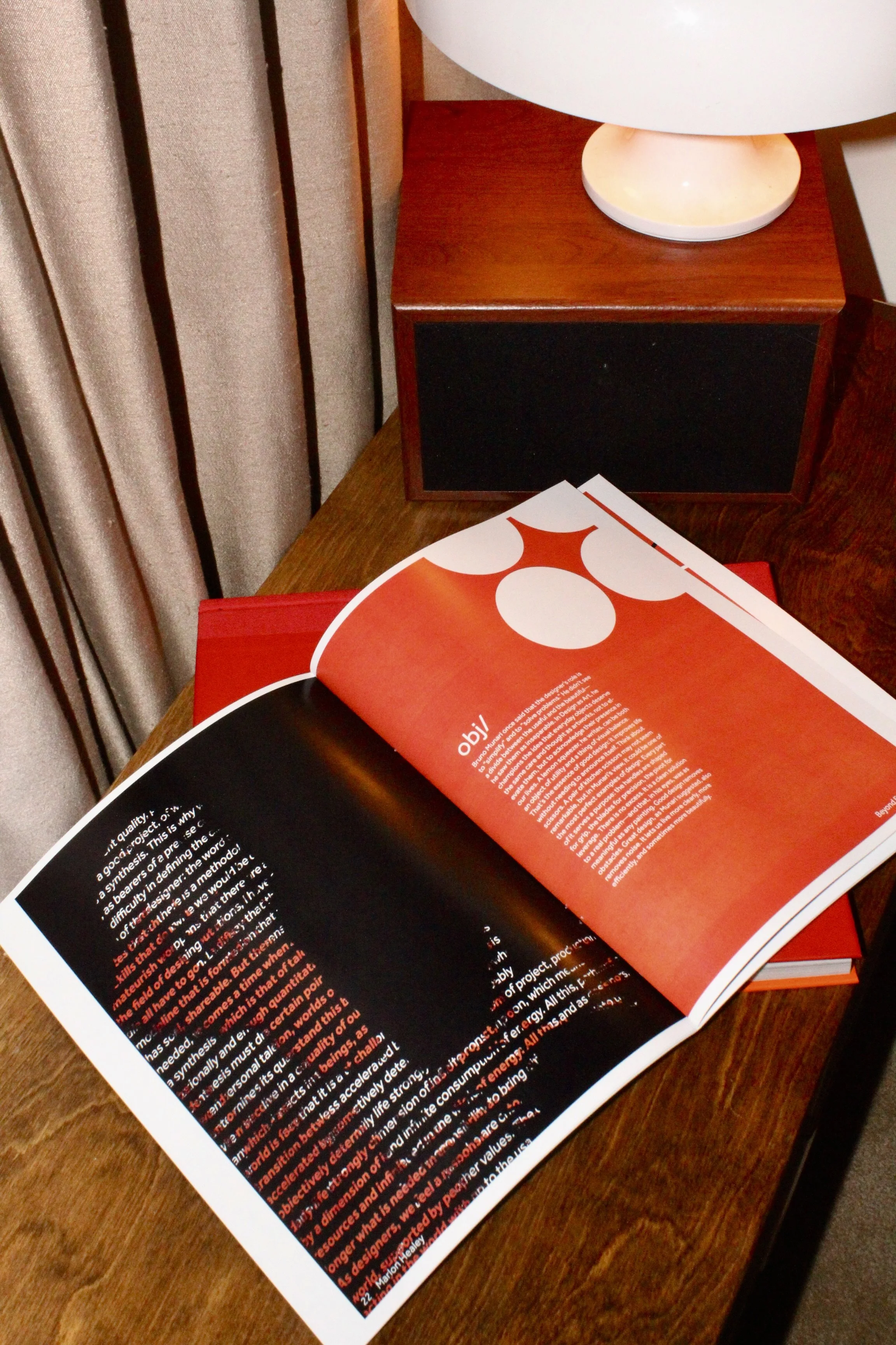
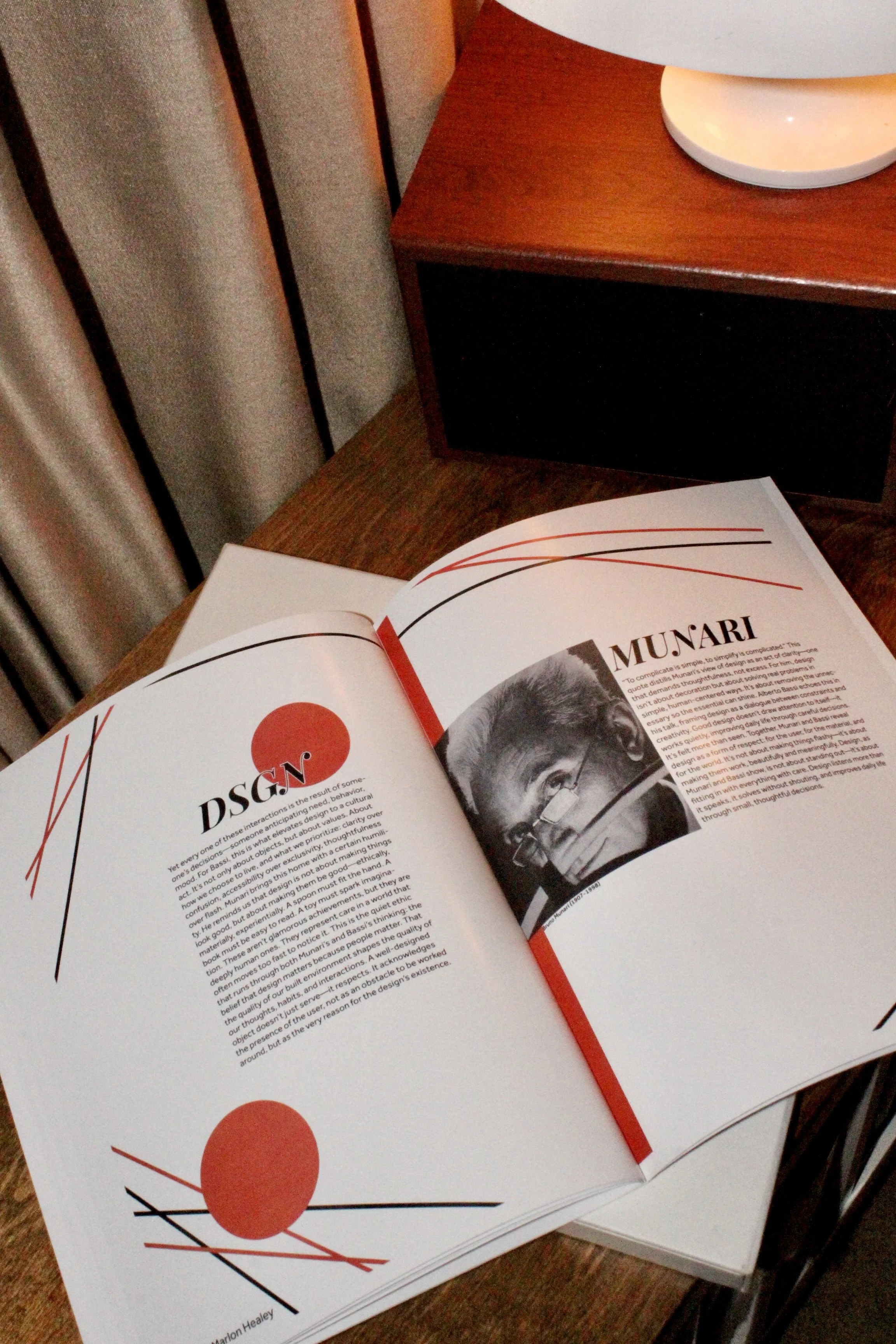
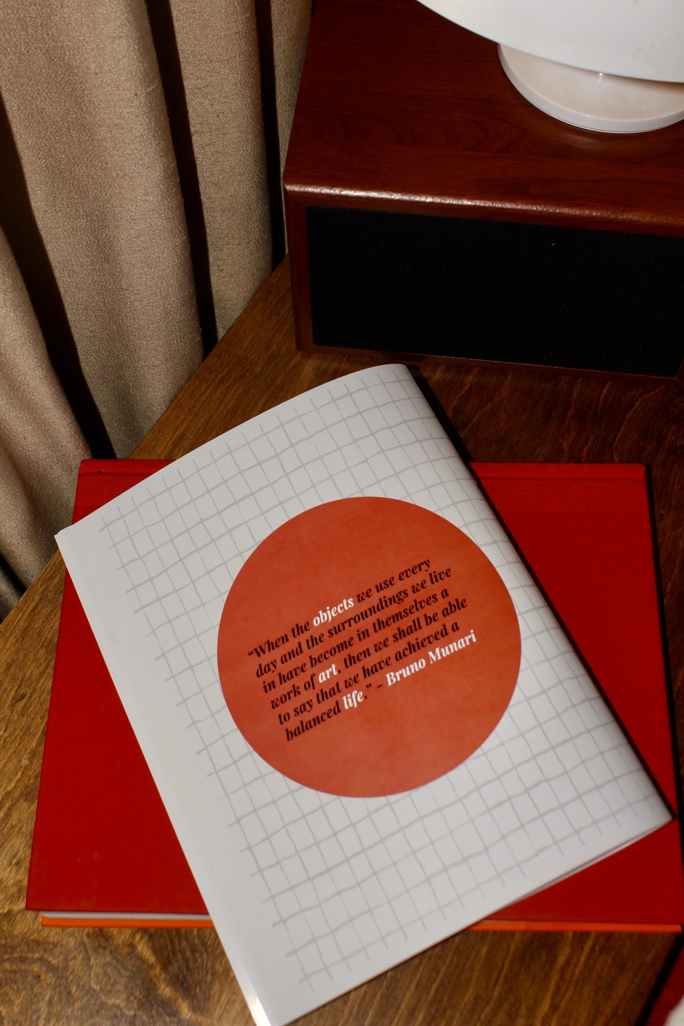
This magazine compares between two pieces; “Design as art” by Bruno Munari and take sections of “What is the difference between an ordinary object, a work of art and a design project?”, by Alberto Bassi. In this magazine, I also skillfully display the use of typefaces.
Color Palette + Typography

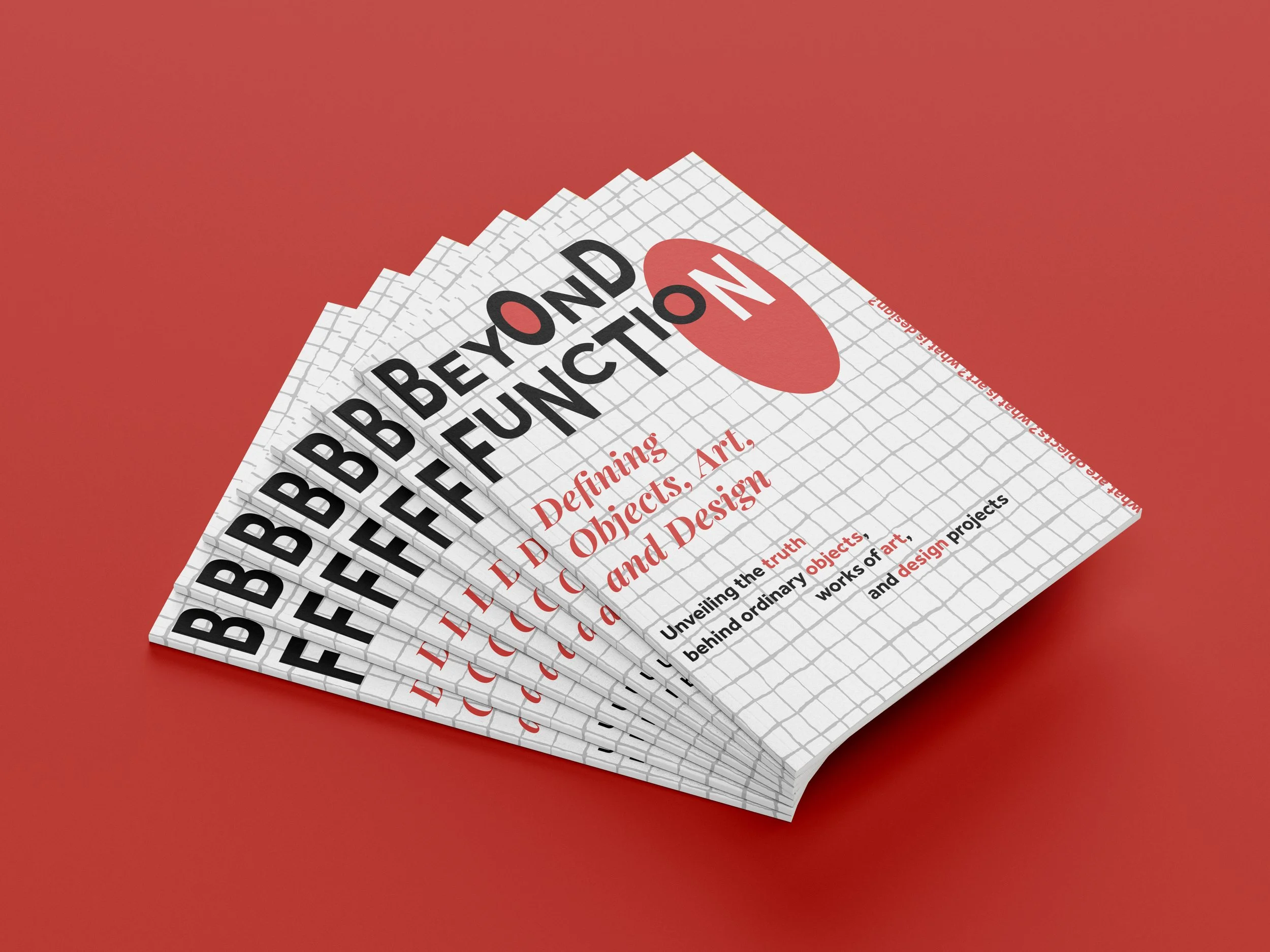
Minimalist color palette of red, white and black to give the magazine a modern look/feel.
